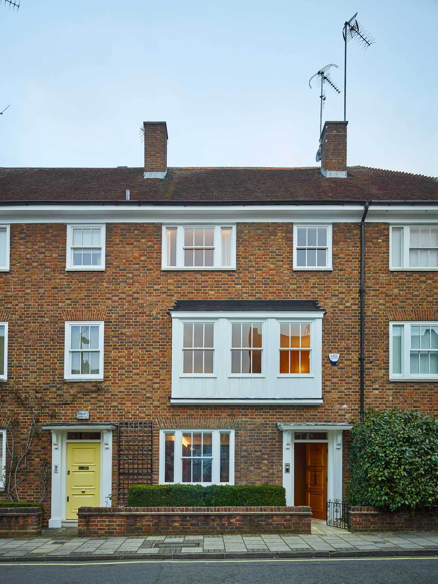
Minimalist in interior design, rich in simplicity – Caroline Place is a home located in London, United Kingdom, designed by Groupwork and Clerkenwell-based Amin Taha Architects.
Surrounded on three sides by eight and nine story mansion blocks shielding it on Bayswater Road and on Queensway, Caroline Place is an enclave of late 1950’s terraces blessed with seclusion in an otherwise heavy traffic neighbourhood.
Built with a Modern Northern European sensibility of sharp brick lines and crisp mortar joints layered with softer timber detailing, their interior layouts remained firmly rooted in an earlier English Edwardian tradition.
Retaining a desirous separation of served and servant areas of maids’ rooms, sculleries, coal houses and a working yard, altogether occupying the ground level while the owners were set out above, across larger light filled rooms.
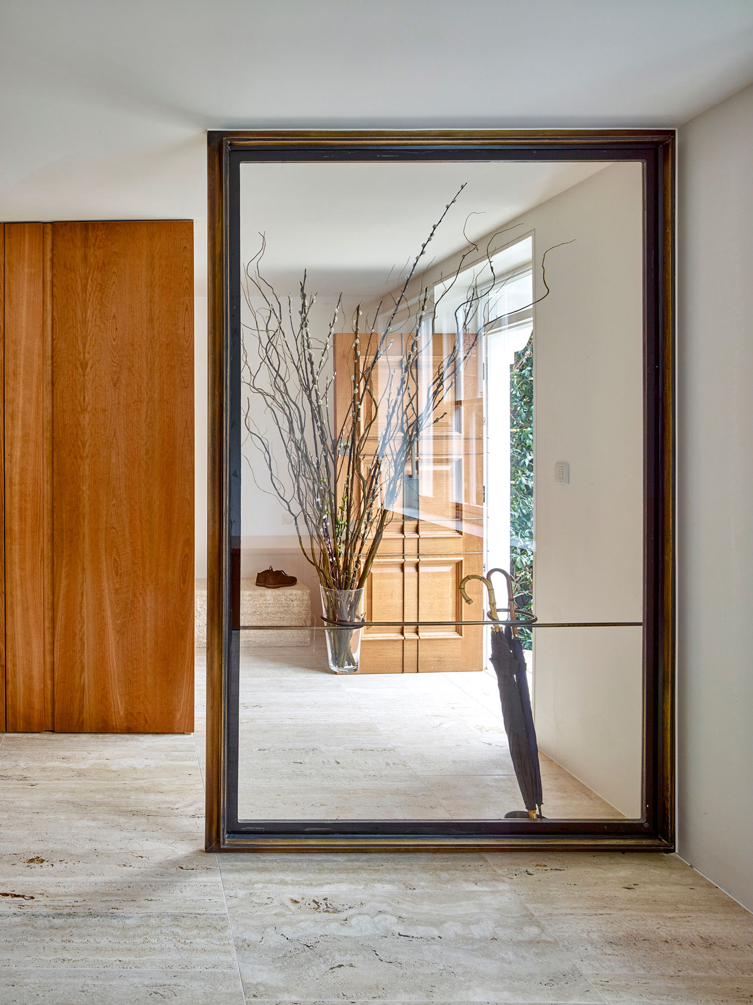
The flooring remains timeless, with remains of original travertine in site, along with densely plastered walls behind 1970s pine boarding, and one room panelled with dark cherry wood.
[plugmatter_promo box = ‘9’]
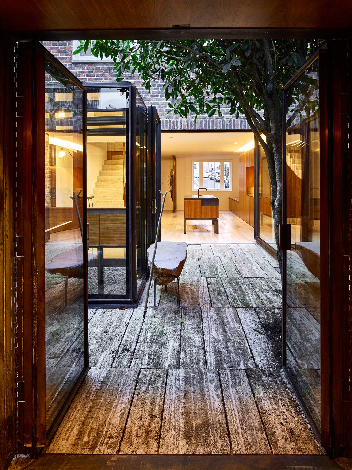
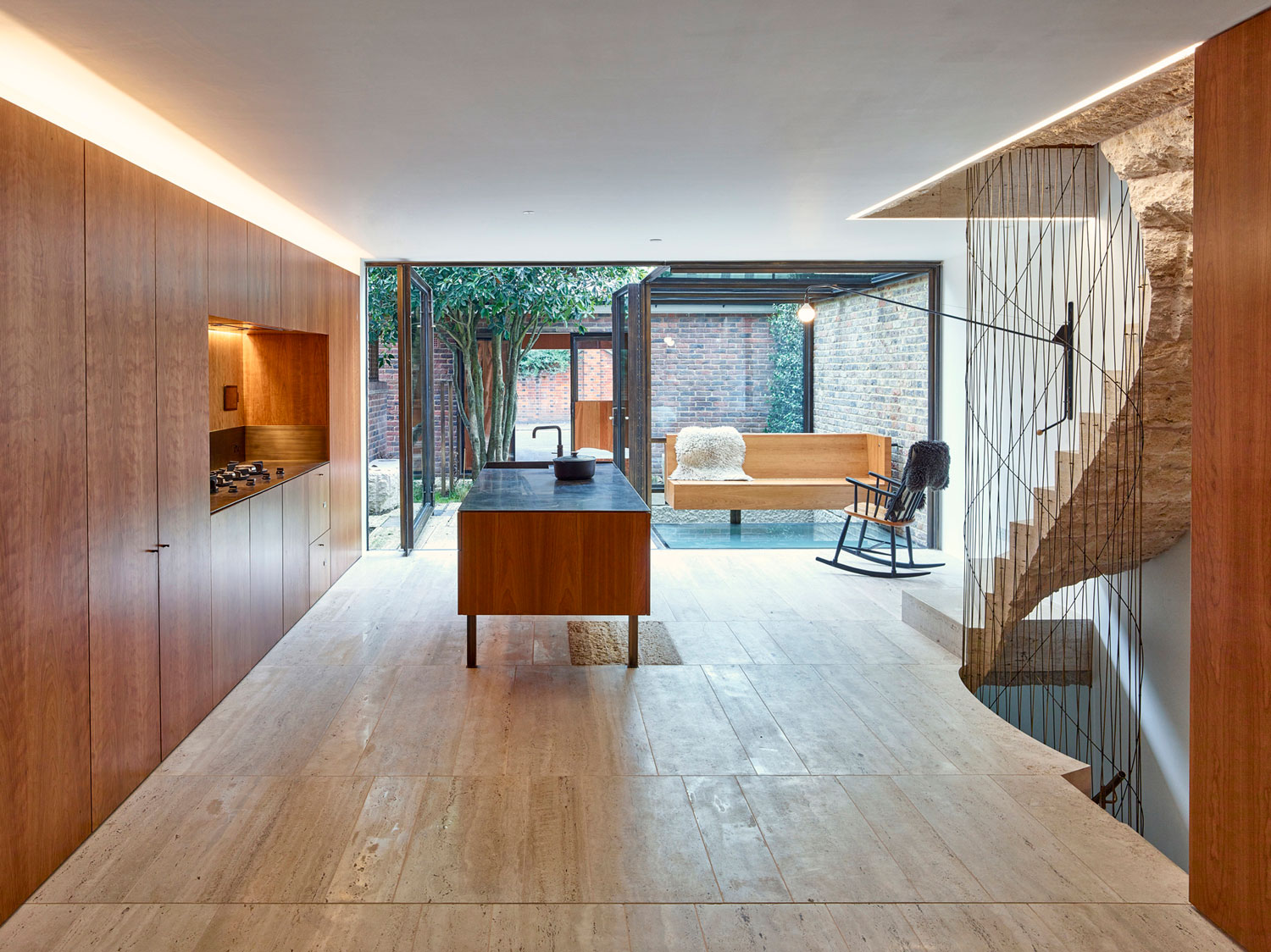
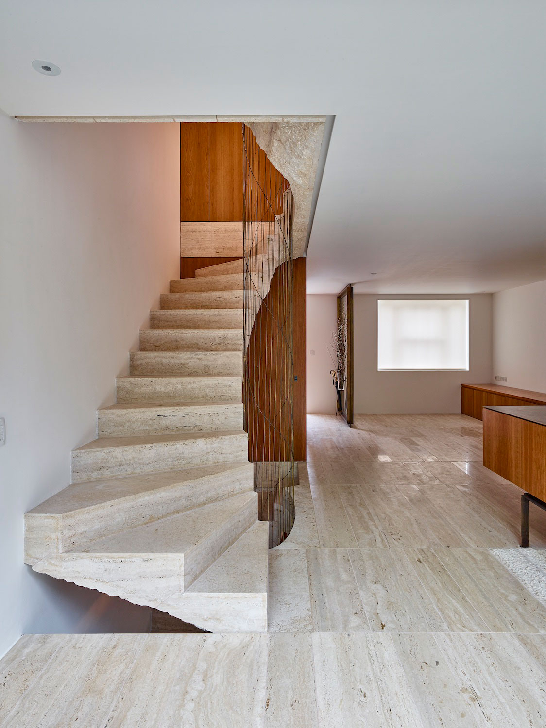
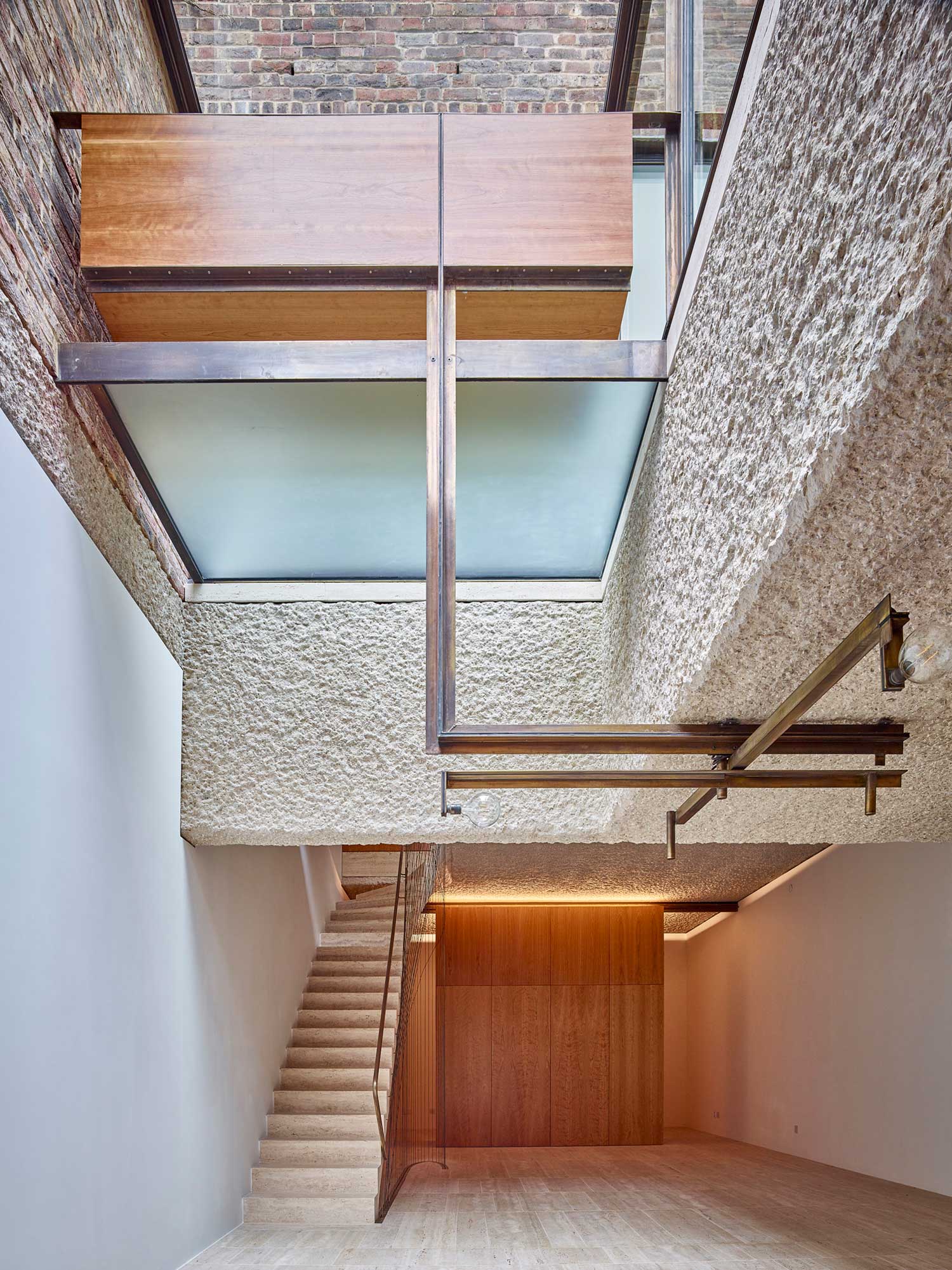
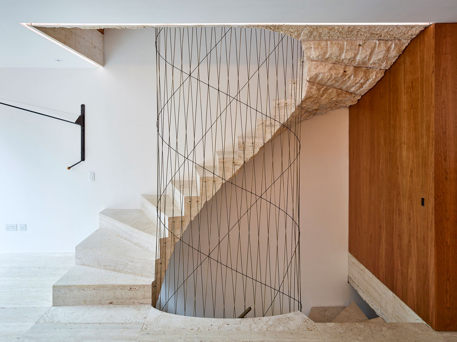
As travertine has a wide spectrum of textural and visual possibilities, its reintroduction allowed for a hard-wearing surface on each floor, including the open courtyard and into the detached garage.
Varying from quarry-tooled to polished, the finishes emphasize and differentiate the journey from the interior to exterior, and from the basement upwards.
The social intentions behind the open-plan arrangements are accentuated by a clearer ‘tabula rasa’ across each floor, with the removal of downstand beams and brick nibs that had been structurally necessary at the time, but unintentionally retained the memory of separate rooms.
Each floor can be considered as a single shell of travertine and plaster, allowing the specific type of occupation to lend further definition.
The first floor can be occupied as a single reception with a corner study or subdivided by two pivoted bookcases, one of which reveals a foldaway bed and provides a guest room.
The cabinetry elements are full-height with shadow gaps and rebated lighting to emphasize their standalone role.
This language extends to bathrooms and walk-in wardrobes, ‘servant’ spaces whose discretion is maintained by secret doors and their concealment within bookcases
The first floor can be occupied as a single reception with a corner study or subdivided by two pivoted bookcases, one of which reveals a foldaway bed and provides a guest room.
The cabinetry elements are full-height with shadow gaps and rebated lighting to emphasize their standalone role.
This language extends to bathrooms and walk-in wardrobes, ‘servant’ spaces whose discretion is maintained by secret doors and their concealment within bookcases.
The restored travertine, cherry panelling and plastered walls are offset by new details that allude to mid-century work by Carlo Scarpa, Mies van der Rohe and Louis Kahn.
Point-tooled and fair-faced concrete, polished and patinated brass, cruciform columns and glazing details lightly reference the period.
New but related to the existing, they might in future be mistaken for original features.
Images Via: www.yellowtrace.com.au

